We Drive Solar
November 2024 - February 2025
Group Project · Master Level · Industrial Design Engineering
Course: Graphic Language of Products
Graphic Language of Products explores how brand identity can be translated into product design through the use of visual semiotics. The course is structured in two phases: first, conducting in-depth brand analysis using theoretical frameworks to define explicit and implicit design characteristics; and second, transforming these insights into a physical product concept that aligns with the brand’s core values. The outcome is a visual and tangible representation that communicates the brand's identity through form and graphic language.
This project involved redesigning a white-label electric vehicle charging station to reflect the distinct brand identities of two companies through two main phases.
Phase 1 focused on Bang & Olufsen (B&O), where the charger was redesigned to align with the brand’s minimalist, high-end identity. This phase included in-depth analysis using frameworks like the Brand Identity Prism, Design Format Analysis, and Brand Translation Prism, which were translated into visual and formal elements of the charger.
Phase 2 reimagined the same charger for We Drive Solar, a sustainable mobility company. Based on stakeholder interviews and competitor analysis, the design was adapted to express We Drive Solar’s values of reliability, sustainability, and innovation.
The final outcome is a product family of EV chargers with distinct form language, material choices, and detailing that embody the unique identity of each brand.
Bang & Olufsen
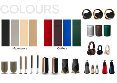
Bang & Olufsen (B&O) is renowned for its high-end, aesthetically refined audio-visual products that combine cutting-edge technology with iconic design. The brand evokes exclusivity, craftsmanship, and innovation. Its design identity is deeply rooted in minimalism, premium materials, and seamless integration into modern living spaces. The semiotic analysis revealed strong associations with calmness, sophistication, and Scandinavian heritage. Key brand characteristics were extracted using multiple models, including Kapferer's Brand Identity Prism and semiotic layers, helping form the foundation for later design decisions.
Ideation
The goal was to translate B&O’s implicit and explicit brand values into a charger design that aligns visually and symbolically with the B&O identity. Sketches explored how elements such as calm geometry, tactile finishes, and a refined colour palette could be integrated into a one-socket EV charger. Concepts focused on blending the charger into premium residential environments without compromising functionality. Iterations considered form language and surface detailing in line with B&O's design identity.

Final Design
The final concept for the B&O charger reflects the brand’s refined and understated visual language. Smooth transitions, muted tones, and material quality evoke a sense of calm and elegance. Designed to merge seamlessly into its surroundings, the charger visually aligns with B&O’s product family and maintains the brand’s design signature.
We Drive Solar
The second phase of the project focused on the Dutch company We Drive Solar, which combines solar-powered mobility with smart energy infrastructure. The goal of this phase was to translate the brand’s identity into a physical product concept using the principles of graphic language and semiotics. Due to time constraints, the two phases (B&O and WDS) were developed in parallel, with two team members (including myself) fully dedicated to the WDS track.
Research & Strategic Insights
The team conducted an in-depth brand analysis of We Drive Solar to ensure the redesign of the EV charger aligned with the company’s identity. Qualitative insights were gathered through direct engagement with the client, which helped surface underlying brand values and perceptions. These were critically interpreted and structured using multiple branding frameworks to identify recurring themes.
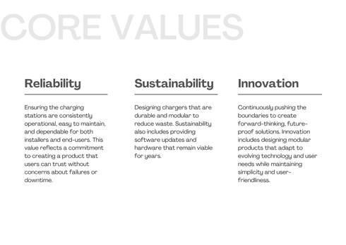
Through synthesis and comparison, three core brand values, reliability, sustainability, and innovation, emerged as consistent across all sources. These values became the foundation for defining the product’s desired expression.
Ideation & Concept Development
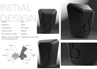
The concept development began by translating key insights from the brand analysis into a white-label EV charger, ensuring a neutral foundation aligned with functional needs. Initial ideation focused on designing a single-socket charger, with hand-drawn sketches exploring how to reflect We Drive Solar’s core values, reliability, sustainability, and innovation, through form and detailing. A full-scale tape drawing session followed, allowing the geometry to be evaluated at 1:1 scale and fine-tuned for proportions and usability. The resulting design was then tested through a user questionnaire to assess how effectively the form communicated the intended brand values. Insights from this evaluation informed several iterations, ultimately leading to a refined final concept that balances technical clarity, visual coherence, and brand alignment.
Final Design & Evaluation
The final design reflects We Drive Solar’s core values through a clean, confident form with soft transitions and approachable detailing. It balances a professional and urban character while communicating innovation and durability. The technical components were fitted into the compact body without compromising the visual clarity of the design. To assess its effectiveness, we conducted a user evaluation focused on perceived alignment with brand values. The results indicated strong recognition of reliability, innovation, durability, and professionalism. However, sustainability ranked lower than expected. Upon investigation, it became clear that colour choices played a role in this perception. Despite this, the material palette includes recycled plastic, wood, and metal, elements chosen for their sustainable qualities. Finally, we extended the concept into a product family, proposing variations offering a coherent visual identity across different applications.
Personal Contributions
This project was completed as a group of four, divided across two phases. While two team members focused on Phase 1 (Bang & Olufsen), I worked on Phase 2 (We Drive Solar) alongside one teammate. Due to tight time constraints, both phases ran in parallel rather than sequentially, requiring efficient coordination across the group.
In Phase 2, I took a leading role in shaping the brand analysis and product design. I co-developed the interview structure used for stakeholder engagement, with a particular focus on creating a graphic-based format to improve clarity and prevent miscommunication around abstract brand concepts. Based on insights from this interview, I led the design development, from ideation through to final concept. All sketches presented in the portfolio for this phase were created by me. I also designed the main product concept, while my teammate supported the process by translating it into CAD models and producing the final renderings.


